Sad, but true: this is the final post in the Amsterdam House Tour. I’ve run out of house to show you. The final room is perhaps the most important, seeing as how it revolves around food. So here you go: my kitchen!
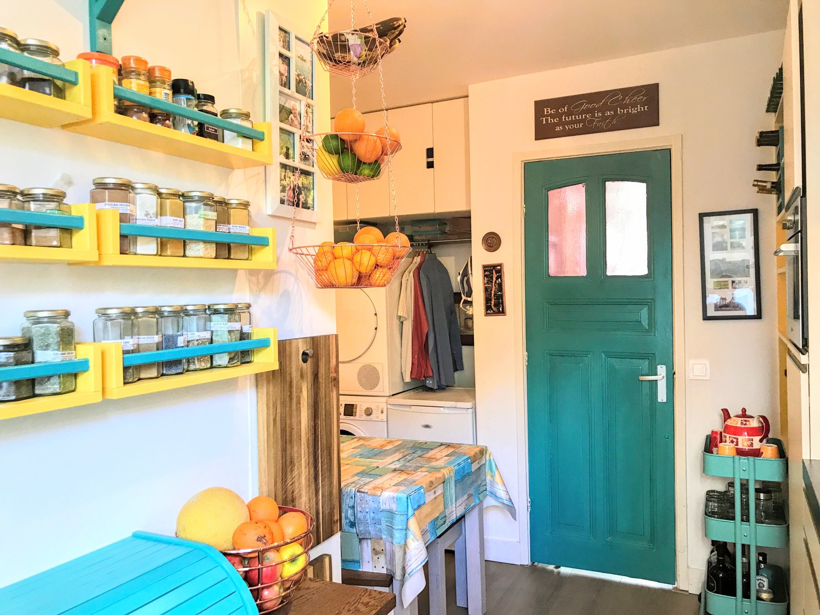 Is that a fun, bright room, or what? I am a little in love with it. As you can see, turquoise is the name of the game. I still feel a bit assaulted by the brightness of it, but I’m pretty sure I like it.
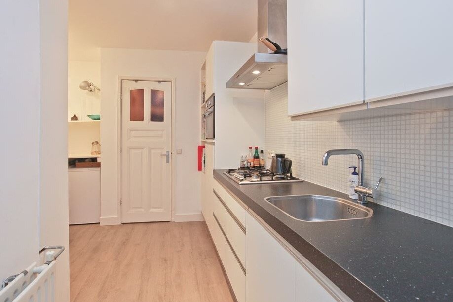
For reference, here’s what it looked like when we moved in. So you can see that for better or for worse, we’ve definitely brought it into technicolor.
 Here’s the even brighter dining nook. Be honest. Is it too much yellow? Because part of me thinks it might be too much yellow. But the other part of me just adores it.
 As you know, we’re hopelessly in love with all the quirky cafés of Amsterdam, so our idea was to reproduce that in our own kitchen. Which meant showcasing some of our favourite little knick knacks from around the world. For example elephants from Indonesia, mug from Aruba, Syrian inlaid box, decorative shot glasses from Vienna and Madrid, Filipino bululs, etc. And these gorgeous Egyptian perfume bottles.
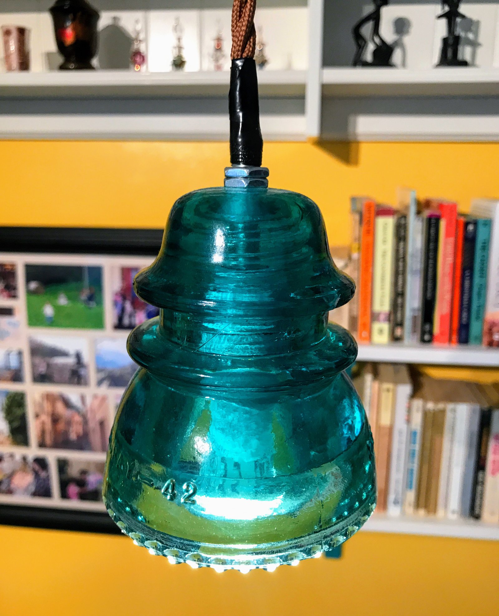
 I also need to bring your attention to this room’s Etsy lamp. It’s probably around 100 years old, and is a fine example of an antique glass insulator, designed to insulate phone or telegraph wires from the wooden poles on which they were hung. I think the fact that it was intended for a specific function and is merely incidentally beautiful is a big part of its charm. These insulators aren’t anywhere near as much of a thing in Europe, so a friend was kind enough to bring it to me from the U.S. last year.
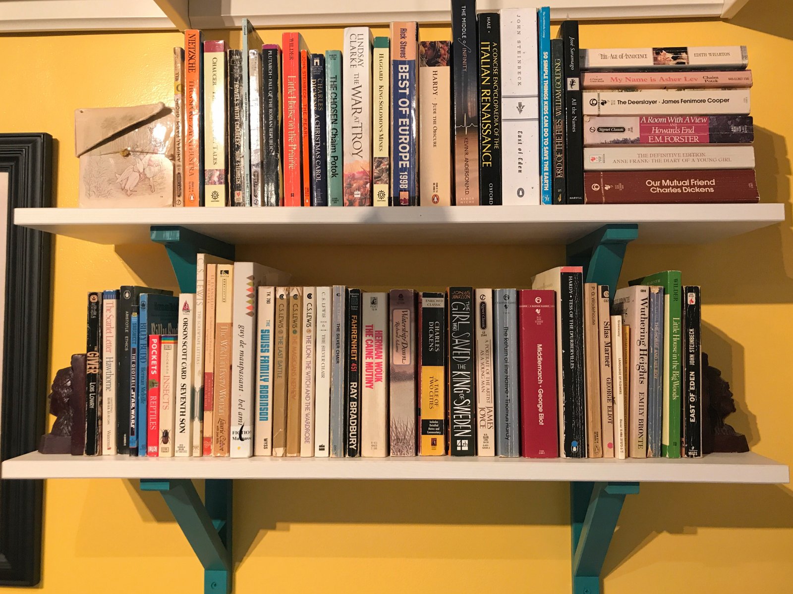
 And yes, in keeping with the vaguely literary vibe of a lot of cafés here, I’ve managed to fit in a couple of extra bookshelves in this room, stocked with everything from travel guides to classic literature.
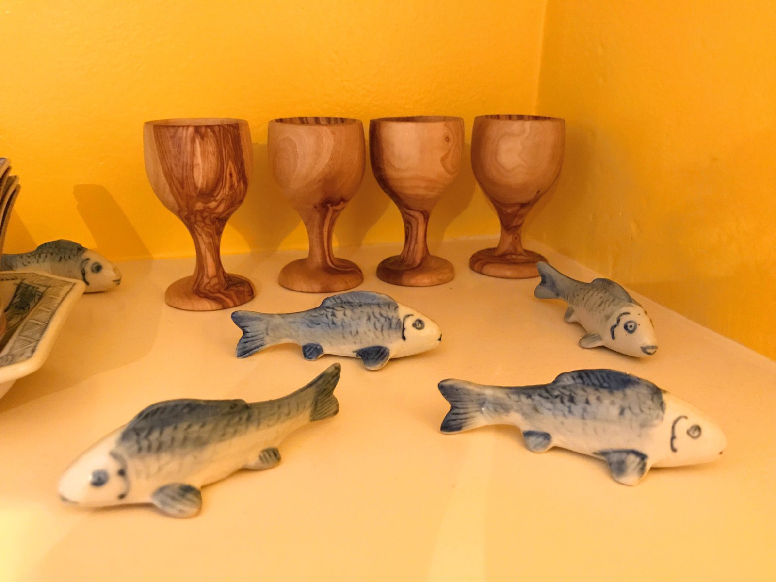
 The shelves to the left of the table hold some of our prettier dishes, including a china soup tureen and set of bowls that was gifted to us by Tony’s mom, and came with these cute little fish intended to serve as rests for your chopsticks. And the hand-turned olive wood egg cups from our Christmas in Malta last year, which I can now say we have actually used to eat soft boiled eggs. Once.
 At 775 square feet (72 square metres), ours is not the type of house where you get the luxury of a laundry room. As you can see in this flashback photo, the hookups were in the dining nook.
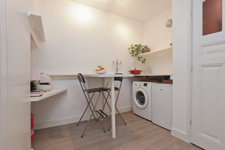 That’s the previous tenant’s washing machine. You might think the thing on the right is a dryer, but it’s actually the freezer. Lots of people don’t have dryers here. In fact, in all of our previous houses outside the U.S., including Italy, Tunisia, Ireland, the Philippines, and the Netherlands, I remember exactly one that had a dryer. It was in Ireland, where if you hang your washing outside you have an approximately 85% chance of it getting wetter rather than drier. We didn’t even actually have a separate dryer there. It was a combination washer/dryer that was big enough to fit about five items of clothing, took over three hours to finish a load, and ended up drying the laundry to a level of overheated dampness that did not improve the longevity of the clothing.
In this house, though, we felt we needed a dryer. Because you have already seen the rest of the rooms in the house, and in none of them is there space for the 3-4 drying racks that need to be perpetually up to keep a family of four in clean clothes. So we set up that corner of the nook into a compact laundry station.
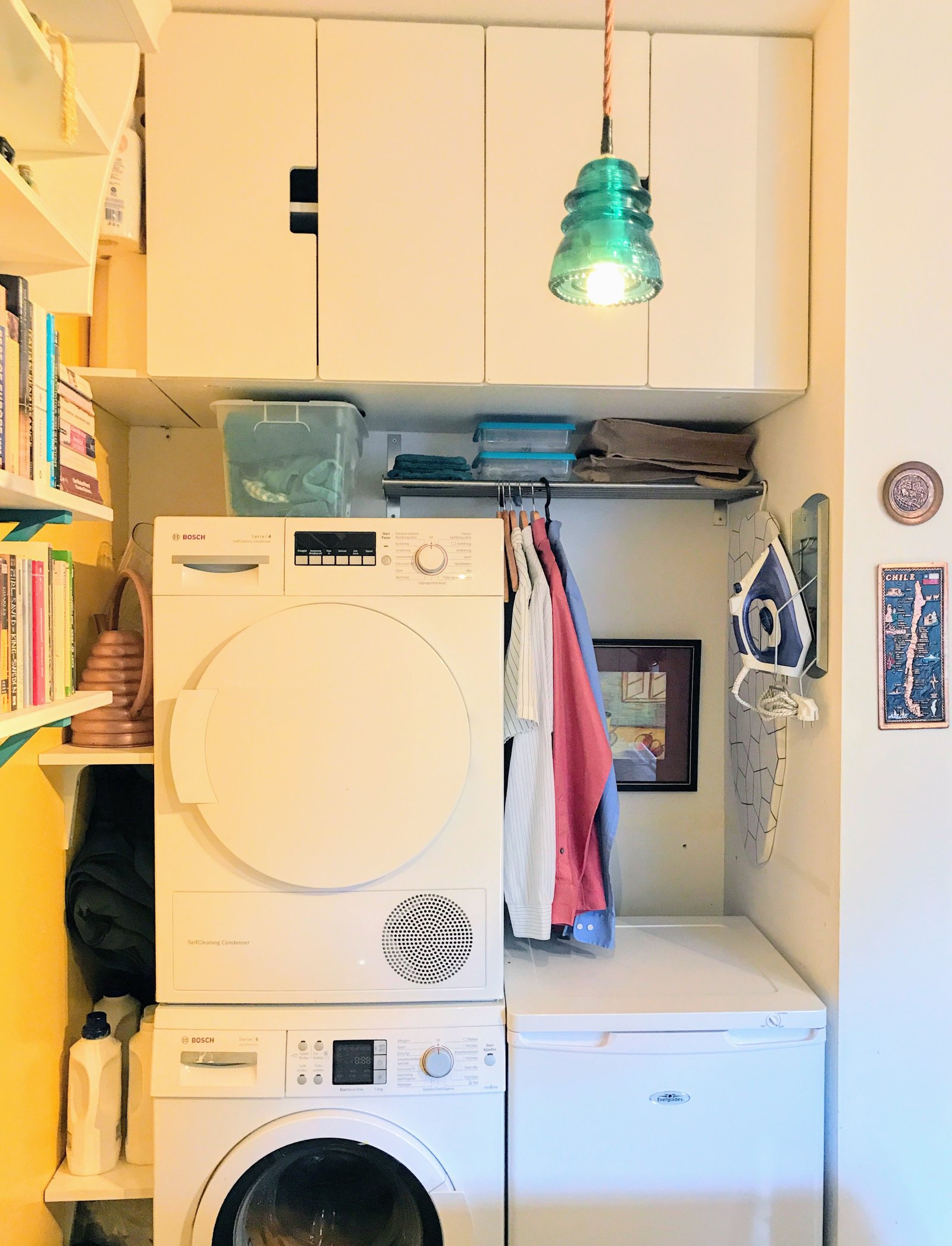 Over the freezer we’ve installed a rack for clothes that need to be ironed (you can see the ironing board and iron hanging on the wall). To the left of the washer/dryer there’s space for shelves to hold laundry detergent, as well as a tiny rubbish bin for lint. The whole thing is a bit awkward if you’re trying to do laundry while your kids snack at the table, but it’s just one of those compromises of small space living.
Speaking of which, one of the first things an American thinks when walking into a European kitchen is, “where’s the refrigerator?” Here they’re camouflaged to match the kitchen. And usually half the size of a normal American refrigerator. Ours is across from the dining nook, behind that open door directly underneath the combination oven/microwave. I’m also hoping that you notice that fabulous yellow kickboard, a legacy of the several months I spent reading Apartment Therapy daily when we first moved in.
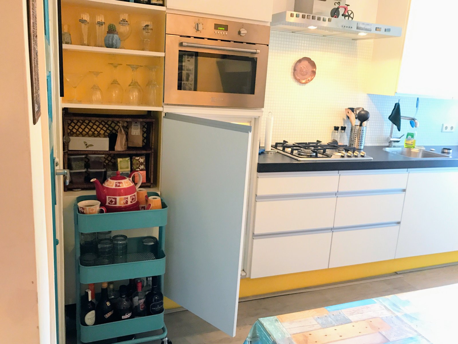 To the right of the refrigerator is a series of tightly organised drawers. For example:
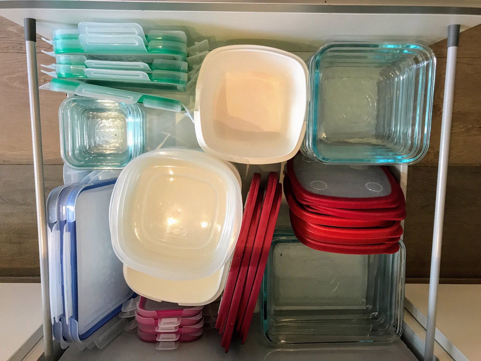 And further down, past the sink, is the dishwasher, also disguised as a matching kitchen cabinet.
As with most rooms in our house, the main challenge here was fitting everything in while still keeping it a liveable space. One of the things we realised immediately was that we were going to need some extra counter space. But how to achieve that in a tiny kitchen already bursting at the seams? Well, you probably already noticed that there aren’t any chairs around our kitchen table. Instead, we have low profile benches that can be pushed all the way under to save space.
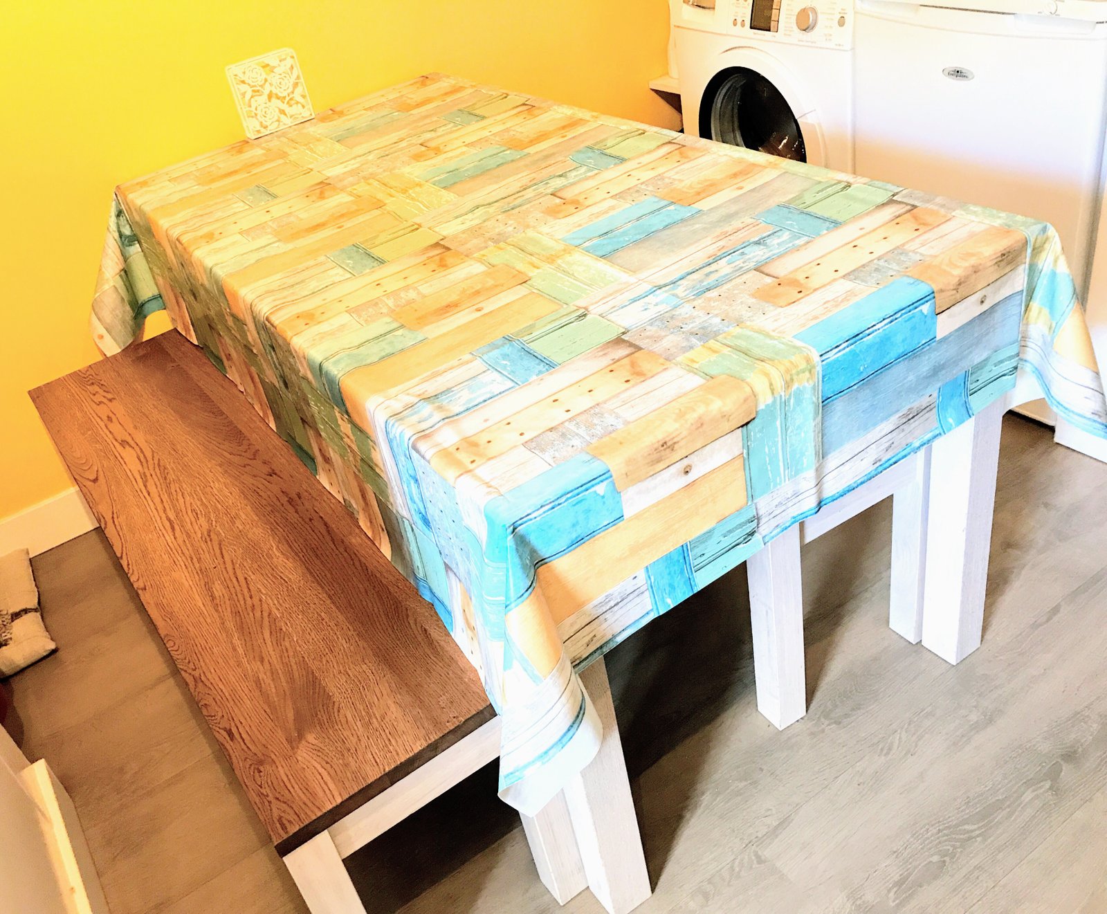 With most clever and resourceful brilliance, I hit upon the idea of getting a third bench (from IKEA of course, the source of all good things). We mounted it at counter height with one side against the wall, and the other side held up by two legs on each end, stacked on top of one another and bolted at the seam.
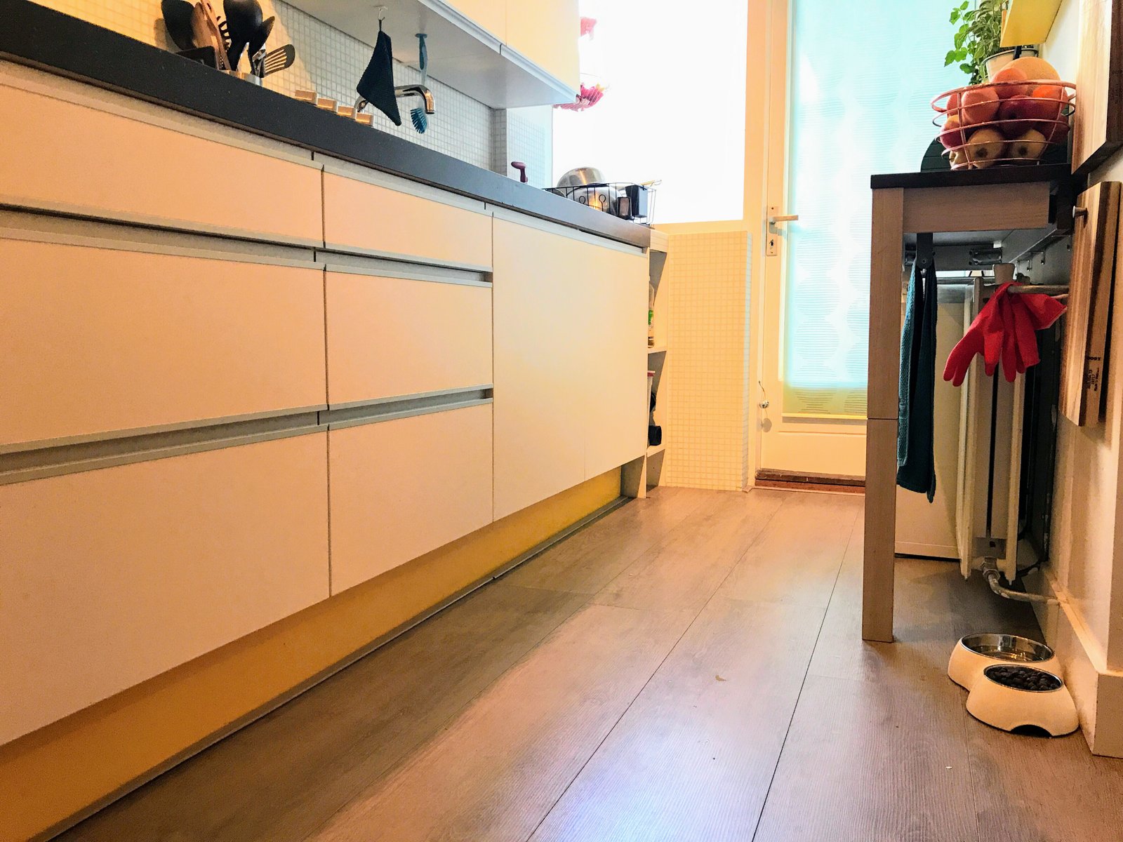 Look more closely, please. I really can’t contain my delight with this cleverest of IKEA hacks, which also manages to conceal the kitchen radiator and provide space for yet another cabinet, as well as a place to hang a dish towel and rubber gloves.
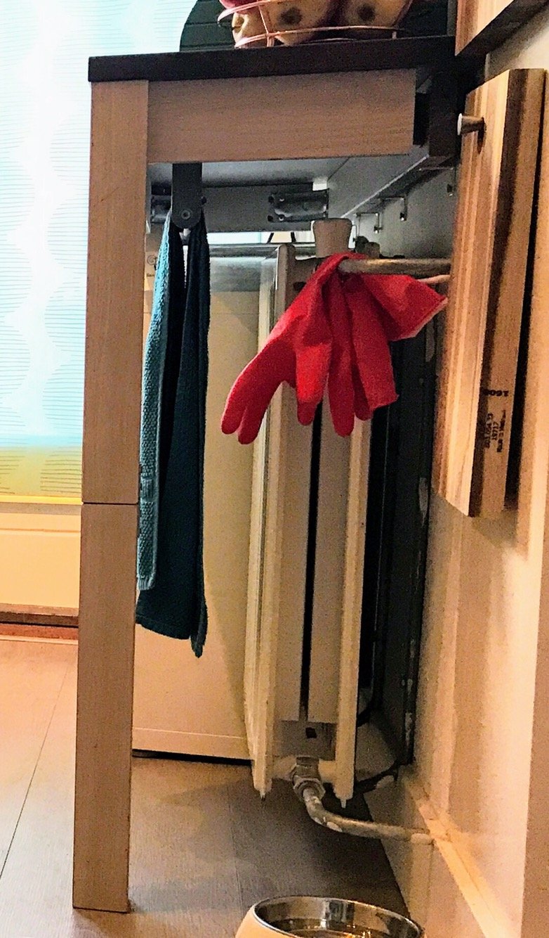 Here’s a view from the top, where you can see we quickly filled the thing up with a fruit bowl, bread box, toaster, toasti maker (don’t ask; they both get used daily), and electric kettle (also an absolute necessity, I promise).
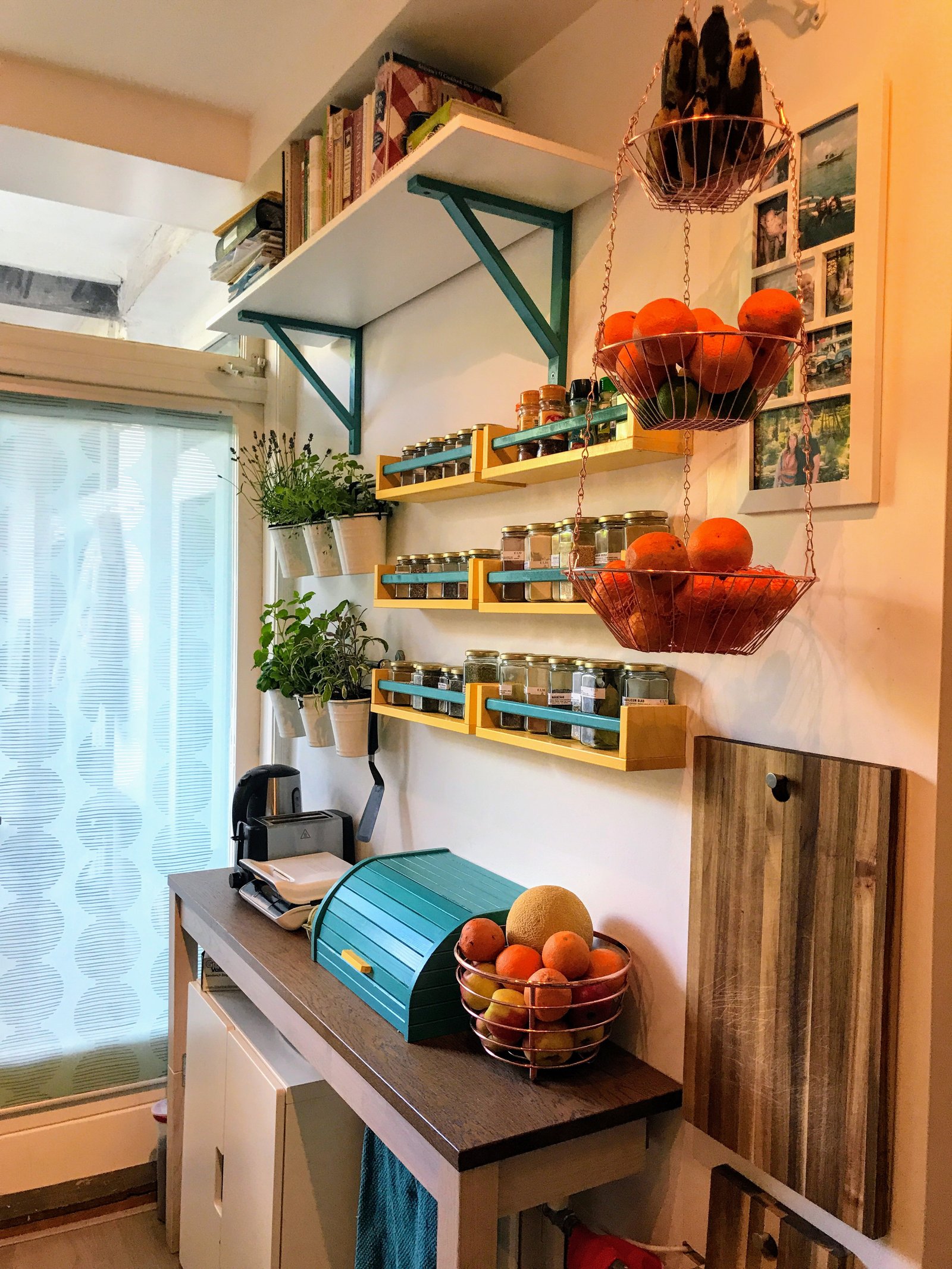 Now is probably also a good time to point out my two-toned spice racks and my darling little kitchen herb garden. Full disclosure: I bought the herbs the day before taking this photo, because I’ve already killed a set. I really need to stop planning plants into my interior decor.
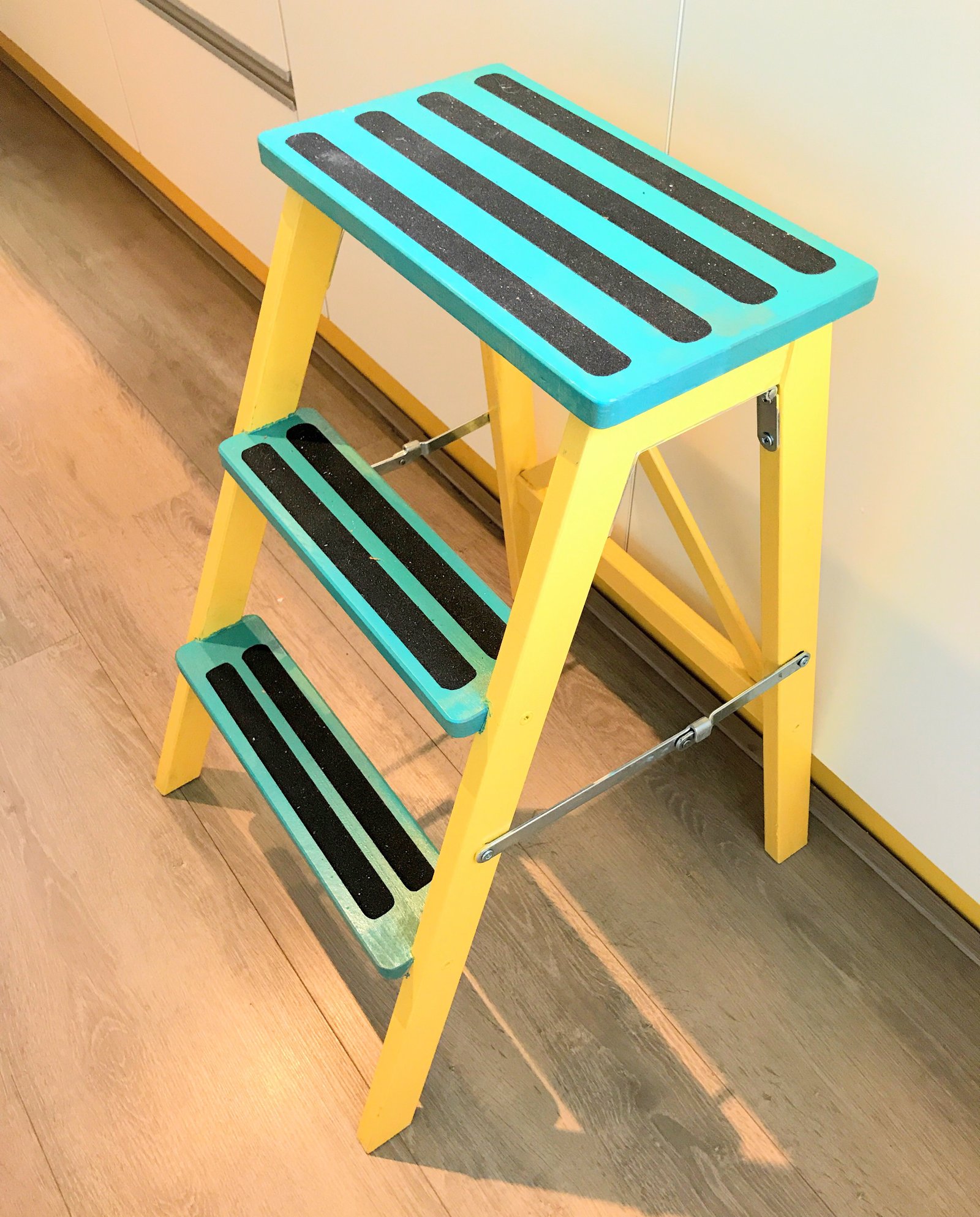
 Just a few more random things to show, like the cute stool we painted to match the kitchen, because I am way too short for most Dutch cupboards.
 And this plaque my mother-in-law gave us back when we were Mormon. I still like the sentiment, even if I think of it in a bit more metaphorical terms now. And I think of it as my Mormon wall, since directly on the other side of it is that lovely stained glass of she made us of the San Diego temple, which you met when we explored the hallway.
 Next to it is our decidedly in-Mormon corner, complete with turquoise wine rack and Tony’s collection of beer glasses.
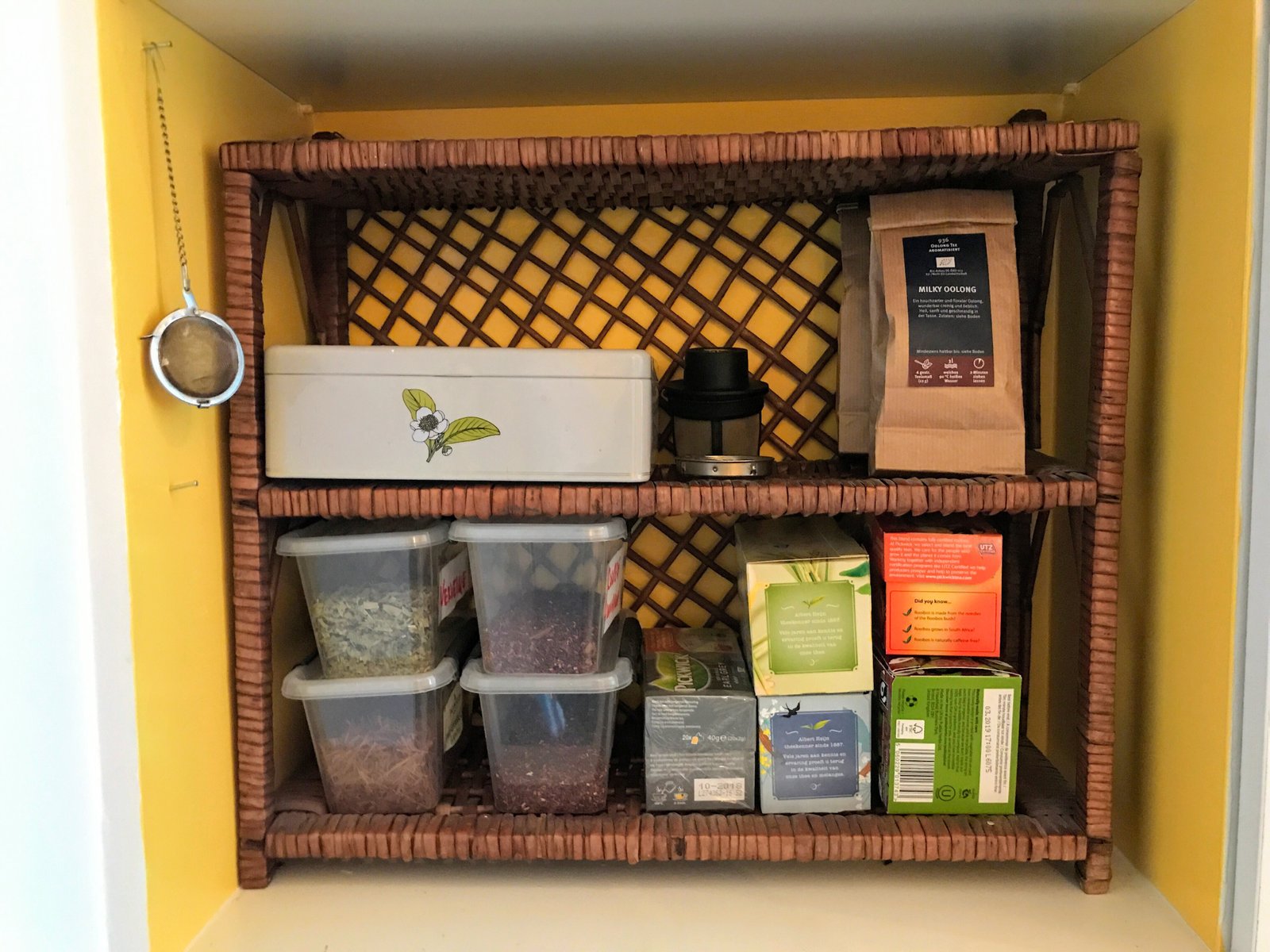
 Below that is my tea shelf. I found this cute little wicker shelf left out as trash on a curb in the centre of Amsterdam and toted it home on foot, not sure what I would do with it, but certain I had to have it.
 Just in front of it sits my favourite piece of furniture in our entire house: my portable Råskog bar cart/tea tray. You already met a tan-coloured version of it in the bathroom, where it works perfectly as a place to hold extra towels.
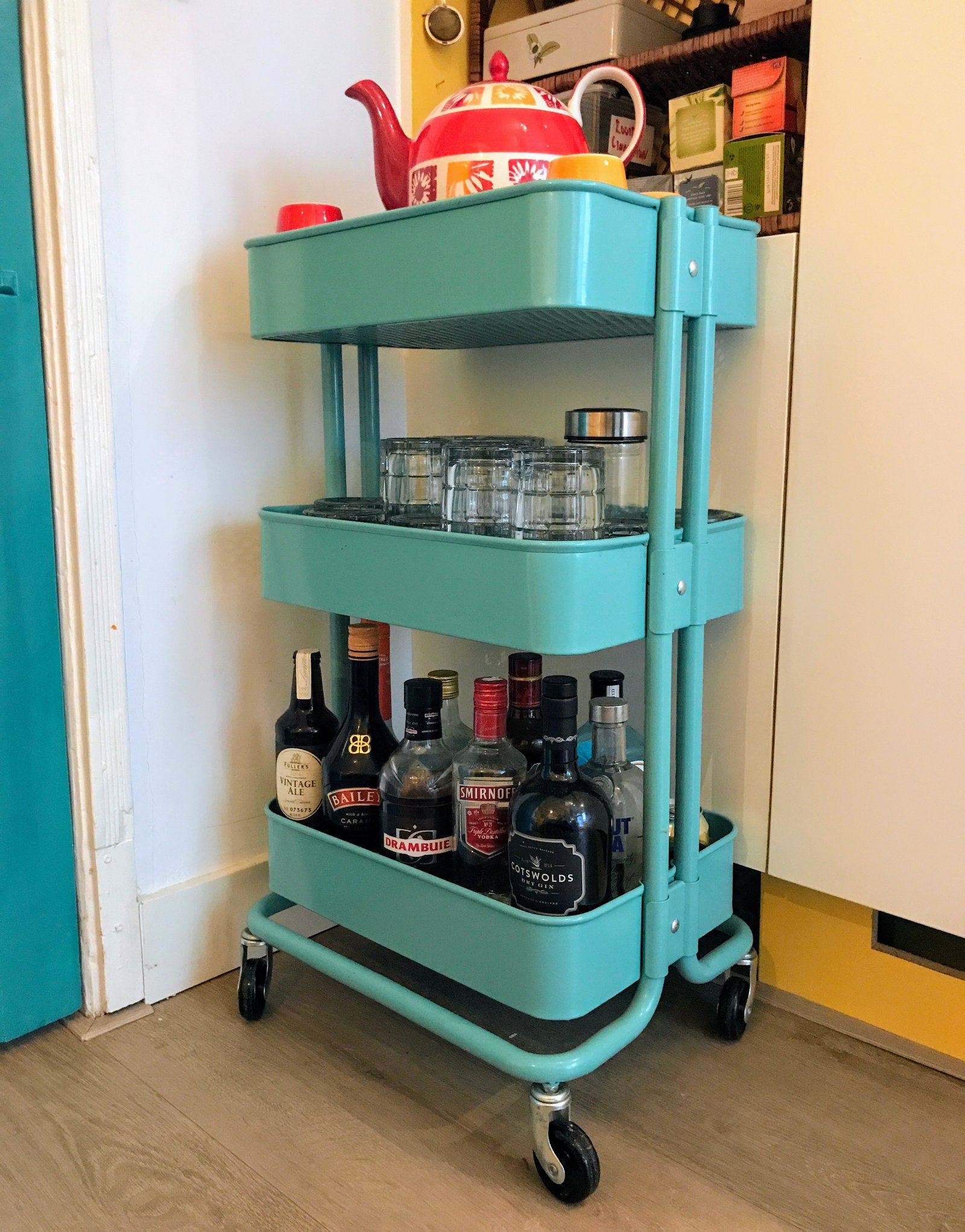 It fits perfectly right here as a home for my beloved teapot, but I can also roll it all over the house, whether I need to serve tea or mix cocktails. It’s as practical and beautiful a piece of mid-century design as you could possibly find anywhere, and I highly recommend it as a sturdy, portable piece of extra storage that looks darling and fits in all manner of small spaces.
And that’s the end of our tour! I hope you’ve enjoyed it, and would be more than happy to repeat it in person if you’re ever in the vicinity. Until then, tot ziens!

I enjoyed the tour! The kitchen colors look great!